Travelling exhibition on DIY paper stuff / curated by Zabar
first stage >
in collaboration with Arci Stand By / from 28/12/2010 to 7/1/2011 / Genia, libreria Libriamo, bar Pasador, ottica Sharingan / Santeramo in Colle (Italy) / progetti di Eleonora Aquili, Chiara Bitetti, Alberto Bolzonetti, Serena Caldarozzi, Patrizia Capriotti, Francesca Casartelli, Chiara Cavanna, Stefania Fucci, Pina Grieco, Akina Hanano, Paola Iacobellis, Lalalab, Samantha Nuzzi, Ivano Troisi, Zabar, Xiao Zhuoyun
second stage >
in collaboration with Cartastorie / half March / Crepes&Books / Altamura (Italy) / do you want to partecipate? send your project no later than 06/03/2011
Showing posts with label All. Show all posts
Showing posts with label All. Show all posts

things are getting better

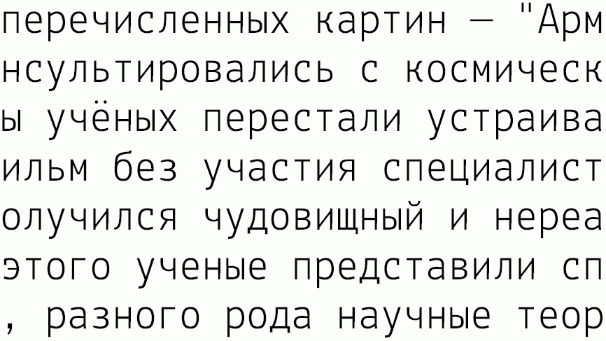
Hi! I am a type designer consulting for Google on their Web Fonts project
- http://code.google.com/webfonts - and we are publishing Lekton :-)


Hi Luc
I was told that you were able to host typefaces that were under
open font license.
We had worked on Lekton with Luciano Perondi some time ago
(I've seen you've posted something about it in your site).
Well, now we are tring to figure out a way to collect the "historical
archive" of the typefaces, from the oldest to the latest version.
We tried some free ways to upload, but all of them were usless since, both
altervista and freeuploading sites needed an 'additional click'.
We are writing you because we would like to made Lekton avilable to a larger
additional audience, in order to get the project growing.
If you are interested please tell us something so that we can send you the
entire archive.
Thanks in advance
open font license.
We had worked on Lekton with Luciano Perondi some time ago
(I've seen you've posted something about it in your site).
Well, now we are tring to figure out a way to collect the "historical
archive" of the typefaces, from the oldest to the latest version.
We tried some free ways to upload, but all of them were usless since, both
altervista and freeuploading sites needed an 'additional click'.
We are writing you because we would like to made Lekton avilable to a larger
additional audience, in order to get the project growing.
If you are interested please tell us something so that we can send you the
entire archive.
Thanks in advance
Bari, Città Culturale
Tesi di laurea in progettazione grafica al Politecnico di Bari
Facoltà di Architettura - CdL Disegno Industriale
A.A. 2007/2008
Relatore: Mauro Bubbico
Studenti: Giuliano Chimenti, Silvio Lorusso, Filippo Taveri
Facoltà di Architettura - CdL Disegno Industriale
A.A. 2007/2008
Relatore: Mauro Bubbico
Studenti: Giuliano Chimenti, Silvio Lorusso, Filippo Taveri

Dear Lekton
Thanks a lot for submitting your procect for Slanted magazine #11 dedicated to typewriter and monospaced fonts.
We received many interesting submissions and have now chosen the most suiting ones.
Unfortunately we cannot present your project in this issue.
But we are always looking for interesting projects and hope that you're going to take part again.
Slanted Magazine #11 will be released on the 27th of August and will then be available at www.slanted.de/shop and in selected shops worldwide.
The next call for entries starts soon at www.slanted.de.
Kind regards, Julia
We received many interesting submissions and have now chosen the most suiting ones.
Unfortunately we cannot present your project in this issue.
But we are always looking for interesting projects and hope that you're going to take part again.
Slanted Magazine #11 will be released on the 27th of August and will then be available at www.slanted.de/shop and in selected shops worldwide.
The next call for entries starts soon at www.slanted.de.
Kind regards, Julia
Hello
I am typedesigner and found because of you the Lekton project.
For an association which is involved in sustainable design (a sort of German no profit organisation).
I developed the Lekton type for our purposes. I attached my work and I think I did some improvements. I didn’t found a possibility to send it to the lekton page.
Thanks for your work, Jan
For an association which is involved in sustainable design (a sort of German no profit organisation).
I developed the Lekton type for our purposes. I attached my work and I think I did some improvements. I didn’t found a possibility to send it to the lekton page.
Thanks for your work, Jan


Latest lekton version
Updates
New glyphs from Daniele Capo
New glyphs from Antonio Cavedoni & from Riccardo Lorusso + trispacing from Galacticus
Thanks a lot to Antonio Cavedoni for new glyphs £@@@@æœ and so on
and to Riccardo Lorusso for new: &!
I added some new features and some new glyphs (ss02 + ss03).
The glyphs are “trispaced”. It means that the space are modular, 250, 500, 750, this allow a better spacing between characters, but allow also a vertical alignment similar to the one possible with a monospaced font.
We were thinking it was a bright new idea, but we discovered that was usual for Olivetti typewriters working with “Margherita”.
Posted by Luciano Perondi on Mercoledì, Luglio 2nd, 2008
I added some new features and some new glyphs (ss02 + ss03).
The glyphs are “trispaced”. It means that the space are modular, 250, 500, 750, this allow a better spacing between characters, but allow also a vertical alignment similar to the one possible with a monospaced font.
We were thinking it was a bright new idea, but we discovered that was usual for Olivetti typewriters working with “Margherita”.
Posted by Luciano Perondi on Mercoledì, Luglio 2nd, 2008
word, thinking machine
Ivrea, Italy, ‘Fiera della Parola’, june 2008.
A nice place, an old park, where the Historical Archive of Olivetti stages each year an event dedicated to celebrate ‘word’. Invited by the organization to present a project, the ISIA students of the 1st year MA, have setted up an installation designed to experience what the word ‘identity’ should mean if related to a place. Big white metal pages disposed through the park, where the visitors should compose sentences or little poems, freely, using magnetic words. Those words, were given to each visitor wright at the entrance of the park. Everyone was able to be part of the process, walking up the hill. Each word was composed in ‘lekton’, the typeface specifically designed to support all the graphic materials for the project.


Posted by Marco Tortoioli, Sabato, Giugno 21st, 2008
A nice place, an old park, where the Historical Archive of Olivetti stages each year an event dedicated to celebrate ‘word’. Invited by the organization to present a project, the ISIA students of the 1st year MA, have setted up an installation designed to experience what the word ‘identity’ should mean if related to a place. Big white metal pages disposed through the park, where the visitors should compose sentences or little poems, freely, using magnetic words. Those words, were given to each visitor wright at the entrance of the park. Everyone was able to be part of the process, walking up the hill. Each word was composed in ‘lekton’, the typeface specifically designed to support all the graphic materials for the project.


Posted by Marco Tortoioli, Sabato, Giugno 21st, 2008
Subscribe to:
Posts (Atom)