Showing posts with label Updates. Show all posts

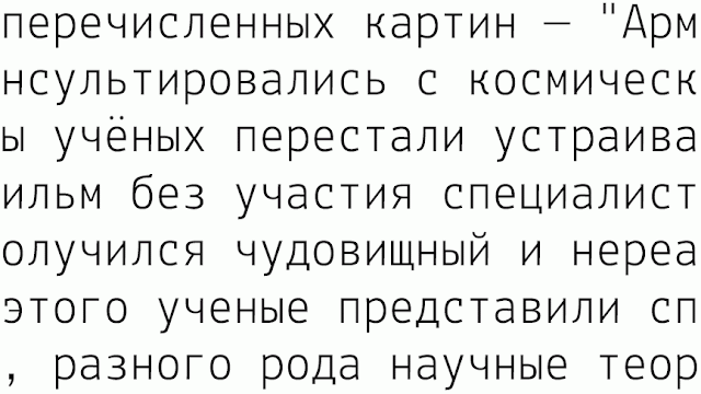
Cyrillic


Something is going on,
so... keep tuned.

Hello

I am typedesigner and found because of you the Lekton project.
For an association which is involved in sustainable design (a sort of German no profit organisation).
I developed the Lekton type for our purposes. I attached my work and I think I did some improvements. I didn’t found a possibility to send it to the lekton page.

Thanks for your work, Jan

Latest lekton version

Improvements by Riccardo Lorusso, Sabrina Campagna, Elisa Ansuini, Raffaele Flauto, Mariangela Di Pinto, Elena Papassissa and Luciano Perondi.
Multiple Master + otf.
Posted by Luciano Perondi on Lunedì, Luglio 27th, 2009

Updates 24 march


Lekton 24 03 2009.
Posted by Luciano Perondi on Martedì, Marzo 24th, 2009

Bold version by Papassissa

Bold Multiple Master.

Posted by Luciano Perondi on Martedì, Dicembre 2nd, 2008

Updates

New glyphs by Marco Comastri, Daniele Capo & Galacticus.
vfb
otf
Posted by Luciano Perondi on Lunedì, Settembre 8th, 2008

New glyphs from Daniele Capo

New ligatures fi, fl and eszet for the trispaced lekton. Thanks! As soon as possible on line.
Comments Off Posted by stefano faoro on Lunedì, Luglio 7th, 2008

New glyphs from Antonio Cavedoni & from Riccardo Lorusso + trispacing from Galacticus

Thanks a lot to Antonio Cavedoni for new glyphs £@@@@æœ and so on
and to Riccardo Lorusso for new: &!
I added some new features and some new glyphs (ss02 + ss03).
The glyphs are “trispaced”. It means that the space are modular, 250, 500, 750, this allow a better spacing between characters, but allow also a vertical alignment similar to the one possible with a monospaced font.
We were thinking it was a bright new idea, but we discovered that was usual for Olivetti typewriters working with “Margherita”.
Posted by Luciano Perondi on Mercoledì, Luglio 2nd, 2008
A basic shape for &

I've added a new source file of Lekton.
I designed a basic shape of &.
I hope that it will be a good starting point for new ideas.

Comments Off Posted by Luciano Perondi on Giovedì, Giugno 12th, 2008

Glyphs in red

The glyphs in red have never been made. We hope that somebody someday somewhere…
Comments Off Posted by Luciano Perondi on Martedì, Giugno 10th, 2008

Really monospaced, at last!

I checked all the spaces and now the font is really monospaced in each glyph…

Download


Posted by Luciano Perondi on Martedì, Giugno 10th, 2008

we need @ and &

I uploaded a newer .vfb file. Some (spacing/hinting) problems were fixed.
Will somebody submit a @ and &? We are looking for bright ideas.

Download


Comments Off Posted by Luciano Perondi on Mercoledì, Giugno 4th, 2008